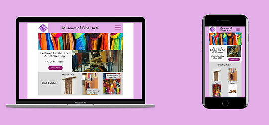
Responsive Website Design- Museum of Fiber Arts
This responsive website serves the purpose of providing information about a public art museum in a concise way. The museum wants to increase public engagement in fun, exciting events that users can visit and get tickets to.


.png)
The Problem
User wants to find an easy way to plan their visit to their local art museum and participate in more events after regular hours of operation.
The Solution
To help the user curate the best experience when visiting the Museum of Fiber Arts by searching for workshops and events by date, art medium, and artist, resulting in a higher participation in museum events from the local community.
My Role
Lead UX Designer and Researcher
Responsibilities
User Research
Wireframing- Paper and Digital
Prototyping
User Pain Points
Pain Point
Pain Point
"Art museums don’t tend to have enough information about how to get involved with the museum. For example, volunteering opportunities and upcoming events."
"Sourcing of the artifacts in the museum is too vague and not detailed enough. An interactive map with more detailed information about how the artifact(s) were obtained and the context/importance of each object would be very helpful."
Pain Point
"I work for the Sandy Spring Museum and the website overall feels disorganized and chaotic. There is also a lack of information on featured artists on the website itself and patrons have to request this information."
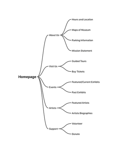
Sitemap
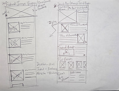
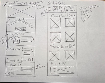
Paper Wireframes

Digital Wireframes
Digital Wireframes (screen variations)
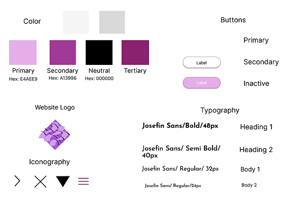
Sticker Sheet
.png)
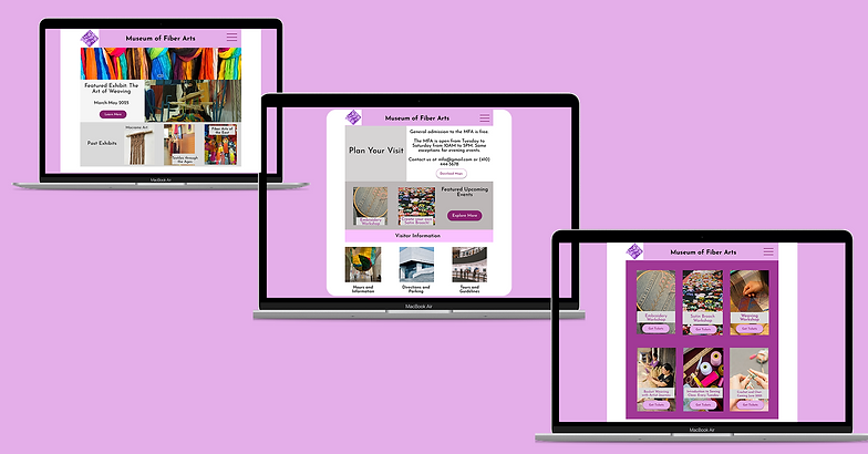
Mockups
.png)

Mockups-Before and After
.png)
Takeaways
-
In an unmoderated study, 5 out of 5 users stated that the responsive website was very easy to use.
-
I learned that although it is challenging to create a responsive design for both mobile and desktop, but it is a rewarding experience because I learned how to scale down to a mobile-first design